Thursday 10 December 2015

Barbara's Claritystamp show - 6th December 2015

Hello there.  I hope you enjoyed Barbara's show on Sunday.  As promised, I'll explain each of my cards in a bit more detail.

Hope you like the vibrant colours of this one created with distress inks (squeezed lemonade, picked raspberry and mermaid lagoon).  I stamped the 'Thank you' first and masked off the centre.  Colours brushed and blended randomly over the background, then spritzed with water.  Then I used the same colours to stamp the butterfly randomly over the background too, for an additional layer of interest.  Many thanks to Pauline Butcher for sharing this technique with me.


I did some background stamping in gold acrylic on this one first as a resist.  The card was then coloured with distress sprays in mermaid lagoon and twisted citron.  Thank you and wee grasses stamped in versamark and gold embossed.  I cut out the aperture and created my central image on a separate piece of card.


A mixture of Paperartsy Fresco finish paints and Paynes Grey Golden Open acrylic were used to create a simple gelli print.  The wee fairies and elves were stamped onto shrink plastic and a tiny touch of glitter added to their wings once shrunk down.   


This background was created with distress inks (blueprint sketch, wilted violet and picked raspberry), and stencil brushes.  Really easy to do, but you need to build up the colour slowly:  plenty of time and patience are needed.  Don't be tempted to try and add too much colour too quickly or you won't get that velvety soft colour blend.  I brushed a little black around the edges too, for added drama.  I went through the stencil with black archival for a drop shadow, before using the copper embossing paste.


A custom inkpad made with distress reinkers (mermaid lagoon and twisted citron) and used for simple pattern building.  When is a tree not a tree?  When its a snowflake of course!


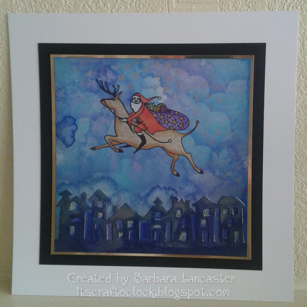
This was made from a gelli print clean up sheet of copy paper mod podged onto a little canvas board.  The stamping was done in black archival and spectrum noir pencils used to highlight and define the scene.  This wasn't what I originally intended, but I love it just the same.


Well I hope that these samples will inspire you to create some art of your own and maybe try something new that you haven't done before.  I'm off to continue with all my Christmas preparations.  I hope you're more organised than me;  I still have an awful lot to do!  Till next time.  Xxx

Tuesday 1 December 2015

Its nearly Christmas...

Hello again.  Oh my goodness, not only is it the first of the month again, but its 1st December too.  So its time for a new Claritystamp challenge;  and now we've shown you ours;  its time for you to show us your Christmas cards!  Where has this year gone?  As you know, November was a very busy month for me, so I had left making this card to the very last minute and needed to do something quick.  I reused a colour scheme I've used for one of my TV samples, so keep a look out for it during Barbara's shows on Hochanda next Sunday 6th December. 
 
 
For this card, I used some music paper as a base to tie in with the theme of the carol singers.  First, I masked off the moon, then brushed with Blueprint Sketch, Wilted Violet and Picked Raspberry distress inks.  It takes quite a while to build up this intensity of colour, so be patient.
 
Remove the moon mask, and brush through a little Fossilised Amber distress ink, concentrating the shading on one side to create an illusion of dimension. 


Stamp the carol singers into position across the base with Black archival.  Use water to lift off some of the colour from the lanterns, then add glow with a yellow spectrum noir pencil.  


Finally, stamp the stars with a Gold metallic encore pad. 


Gilding wax and glitter round the edges to finish.


I hope you like it.  I love how you can glimpse the music through the artwork.  It just lifts what is in reality a very simple card out of the ordinary, I think.  Looking forward to seeing all your ideas and inspiration.  Till next time.  Xxx  

Thursday 26 November 2015

Oh dear, I'm a very bad blogger!!!


Hello there everyone!  Its been a long time I know.  There's been a lot going on, and November has passed in a bit of a blur!  Wonderful news first:  our beautiful new grand daughter Rosie Grace was born on Saturday 14th.  On the flip side, we also marked a year on Friday 20th since we lost Dad:  so many memories...  Its been a mad, crazy, busy couple of weeks at work too;  managing a project to completion on a very tight deadline:  quite stressful, I have to say.  And its nearly Christmas:  have I made all my cards yet?  No!  have I finished all the little gifts I want to make yet?  No!  have I finished my Christmas shopping yet?  No!  So what's on my wish list for Santa?  A few more hours in the day please!


So I thought I'd go through my samples in a bit more detail for those of you who're interested.  


Log cabin, star and sprucescape


1.  I'm not very good at scene building, so I kept it very simple and added a little hide and seek trick with the log cabin.  The tag is just attached with a brad;  easy to do, but positioning is everything.


2.  Thanks to Maria Simms for the inspiration for this one.  I used Peach Bellini adirondack and Hickory Smoke distress ink.  My original plan was to cut it into 3 panels and mount as a triptych, but I was short of time and worried about spoiling it.  Just a touch of glitter added to the trees. 


Elephant and trellis stencils


1.  Bright and vibrant;  Fossilised Amber, Picked Raspberry and Mermaid Lagoon (or maybe Peacock Feathers), brushed and blended through the stencil.  Black embossing paste and black satin glitter for the elephant.


2.  Loads of prep work for this one.  I wanted to use the clever corners for a faux zentangle effect, so first I had to cut out masks.  Then I just stamped through all the different sections with the corners with Black archival and outlined with a black micron pen.  Exactly the same for the baby elephant, but on shrink plastic.  Carefully cut 2 slits and hooked baby's tail around mummy's.  Flitterglu sponged through the trellis stencil and gilding flakes applied.


Colour bursts and stag stencil


1.  This was my absolute favourite.  It doesn't normally bother me, but I could quite happily have kept this one!  Still its nice to hear so many lovely comments about it;  hopefully its inspired you to create some art of your own.  This was a wonderfully happy accident;  a mop up sheet of colour bursts mod podged onto a canvas board, then grunge paste pulled through the stencil.  Some Frantage embossing powder added for texture, then spectrum noir pencils and charcoal to add shading once dry.


2.  This last card also uses colour bursts.  This time I pulled translucent embossing paste through the stencil and added little puffs of colour bursts while the stencil was still in place and the embossing paste was still wet.  I just brushed Mermaid Lagoon and Cracked Pistachio distress inks through the trellis stencil to finish. 


Well that's it for now.  I'm already working on samples for Barbara's show on 6th December.  Hope you'll be able to join us then for some fab new stamps and stencils.  Till next time.  Xxx 

Sunday 1 November 2015

A clean and simple design


Hello there!  I hope you are all well.  I can't believe that its 1st November already;  the days and weeks pass so quickly.  Are you up for a new Clarity challenge?  Don't forget you'll be in with the chance of winning a £50 Clarity voucher to spend on crafty goodies.  You've got to be in it to win it!!!

 
Here's my inspiration for this months theme.  All stamping done in black archival.  I stamped the Japanese lady into position first, and masked her off.   
 
I taped the semi-circle stencil into place, and brushed through distress inks in the following colours, blending from top to bottom:  abandoned coral, barn door and fired brick.  It took a while to get this intensity of colour.

Then I stamped the waterlilies and sentiment along the bottom edge of the stencilled shape.  I stamped the waterlilies again onto a scrap of card, coloured with spectrum noir pencils, and fussy cut.  These were then stuck down flat over any red petals and leaves!!!

Finally, I gave my Japanese lady a beautiful pale complexion with spectrum noir pencils, and made her a dress using fusible fibre.  
 
I hope you like the finished card.  I love its simplicity and drama, and hope you will too.  I look forward to seeing all your entries.  Till next time.  Xxx

Monday 12 October 2015

Just a corner?

Hello again!  Here are 2 more of my cards from last months Clarity show on Hochanda, this time focusing on this gorgeous holly and star corner which comes in 2 sizes.


I made the first in a traditional vintage style, stamping in black archival and colouring with distress markers.  To complete the vintage look, I brushed antique linen distress ink round the edges.  Simply matted and layered to finish.


This second one has a more modern, funky feel.  I made another deluxe, exclusive piece of equipment to help with the placing of the corner and get a neat circle in the middle.  This one took a few practice runs on copy paper to get the positioning right.  All stamping in black archival on watercolour card and the stars masked off with masking fluid, brushos sprinkled on and spritzed with water, and some colour added to the borders with spectrum noir pencils.  A little bit of red stickles added to highlight the holly berries, then simply matted and layered to finish.


Which one's your favourite?  I'd love to know what you think.  Till next time.  Xxx 

Wednesday 7 October 2015

Charming...


Hello again.  This is another of my cards from last months Clarity show on Hochanda using the beautiful new ballerina stamps.  I think this one has quite an Art Deco look about it.


I marked the centre of my card, and made what my dear friend Maria Simms would call a deluxe, exclusive piece of equipment! (aka a punched out and folded post-it circle to use a guide for positioning).  And yes, I did have a couple of practice runs first on some copy paper to check how it worked out.  


All stamping done in black archival, then the dancers were coloured with spectrum noir pencils and a touch of gold glitter added to their oufits.


Just simply matted and layered, and a tiny gold gem in the centre to finish.


I know how lucky I am to be part of the Clarity design team;  thanks to Barbara Gray for believing in me and my work.  I was very proud to see this card on one of the artwork display boards at Port Sunlight last weekend along with work from my talented teamies.  Its such a great feeling;  it really is a dream come true.  Till next time.  Xxx 

Saturday 3 October 2015

Chicken wire

Hello there!  Well today has been a great day at Port Sunlight, catching up with loads of crafty pals, admiring loads of beautiful artwork on display, and soaking up loads of ideas and inspiration from talented demonstrators.  Oh, and not forgetting loads of shopping!

I thought I would share one of my favourite samples from last months Clarity show on Hochanda. using a technique I learned at one of Maria Simms workshops in Shrewsbury.  Thank you Maria!

 
It was really easy to do. 
  • I dragged grunge paste through the chicken wire stencil and left to dry.
  • Using the tags stencil, I cut out a tag, glued a cardboard 'nut' into position, and painted both pieces with blue acrylic paint.
  • Once this was dry, I painted both pieces with black acrylic paint, then wiped some off with a baby wipe (if I'm honest, a few baby wipes!!!!)  I deliberately left it quite grungy as I wanted this 'dirty' industrial look.
  • Then I dry brushed with a tiny bit of silver acrylic paint to highlight.
  • The sentiment was stamped in versamark and embossed with silver detail powder. 
  • Some screw head brads, and then matted and layered to finish.
I have to admit I was really pleased with this one, I hope you like it too.  Till next time.  Xxx


Thursday 1 October 2015

Go stencil crazy!

Hello again.  Yes, its that time again already.  If you didn't enter last months Clarity challenge, I'm hoping maybe me or one of my talented teamies can inspire you to create a project using your Clarity stencils.  I'm looking forward to seeing loads of fabulous entries this month.
 
Here is my project...
 
First, I inked up the centre of the "Home is where the heart is" stencil with watering can archival, taped it into place onto an A5 canvas board and ran it through my embossing machine.
 
 
Using the stencil as a guide, I cut a paper mask of the cloud line, and spread grunge paste over the whole top section of the canvas.
 
 
In a similar way, I spread grunge paste over the lower section.  I tried sprinkling colour burst powders onto the grunge paste while it was still wet to represent flowers, but AAAAAAAAGGGHHHHHHHHH!!!!  Don't like that!
 
 
 Then, to make it even worse;  when I tried spritzing with water, I discovered that I'd got some higher up on the canvas.  It looked a right mess, but I decided to carry on.
 
 
 Then I used a mixture of distress inks and Paperartsy fresco finish paints to colour the clouds, and worked down the canvas with inks.  I tried to create the effect of a beautiful sunrise or sunset. 


OMG!!!!!!  That colour burst smudge is getting worse!
 
 
Then I used a mask to add clouds into the background.  
 
 
Now it was time to start thinking about what I could do to disguise that awful smudge:  foliage and flowers will do nicely.  I used Paperartsy paint through the olive wreath stencil, moving it as required. 
 
 
Next, I cut the house out of an old book page, inked the edges before sticking down, then added a few more leaves to ground it.
 
 
I replaced the home is where the heart is stencil, and pulled grunge paste through the words as shown.
 
 
I added ink to the words, and some charcoal to add depth and shadow.
 
 
Now for some flowers in the garden.  More grunge paste, this time through the flower stencil;  and those colour bursts are still coming through!
 
 
I sponged some white paint through the stencil onto some canvas, ready to colour and fussy cut.
 
 
I coloured the flowers with Spectrum Noir pencils.
 
 
As a final quirky touch, I added some keys for flower stems.

 
This was a project I really enjoyed making:  a journey where I took a few wrong turns because I didn't really know exactly where I was headed until I got there!  I hope you like it, and that maybe you feel inspired to try out a stencil project of your own.  Thanks for visiting;  hope to see you again soon.  Till next time.  Xxx


Sunday 27 September 2015

DT samples for Hochanda TV 27/09/15

Hello there!  What a beautiful sunny day its been here.  I managed to watch Barbara getting all Groovi before going out for Sunday lunch, but missed the first hour this afternoon and will have to catch up later.  
 
These are all my DT offerings for this month.  I'll be blogging them in a bit more detail over the coming weeks.  I hope you like them and find something to inspire you.
Till next time.  Xxx