Sunday 2 July 2017

Christmas in July!

Hello there!  Hope you are all well and enjoying the sunshine.  As I've been asked for instructions on how to do this card, I thought I would blog some simple instructions.  Its actually very easy to do.
 
Here's where we're heading...
 
 
Ingredients
7" x 7" stencil card - Stencil Card 7" x 7" (50 Sheets) ACC-CA-30095-77
Potting soil/coffee archival - Archival Ink Pad - Coffee INK-AR-50037-XX
Distress or Artistry inks in yellow, green and red
Stencil brushes - Clarity Stencil Brushes (Set of 4) ACC-BR-30006-XX
Abstract square stencil - Abstract Squares 3 Stencil 7" x 7" STE-PA-00200-77
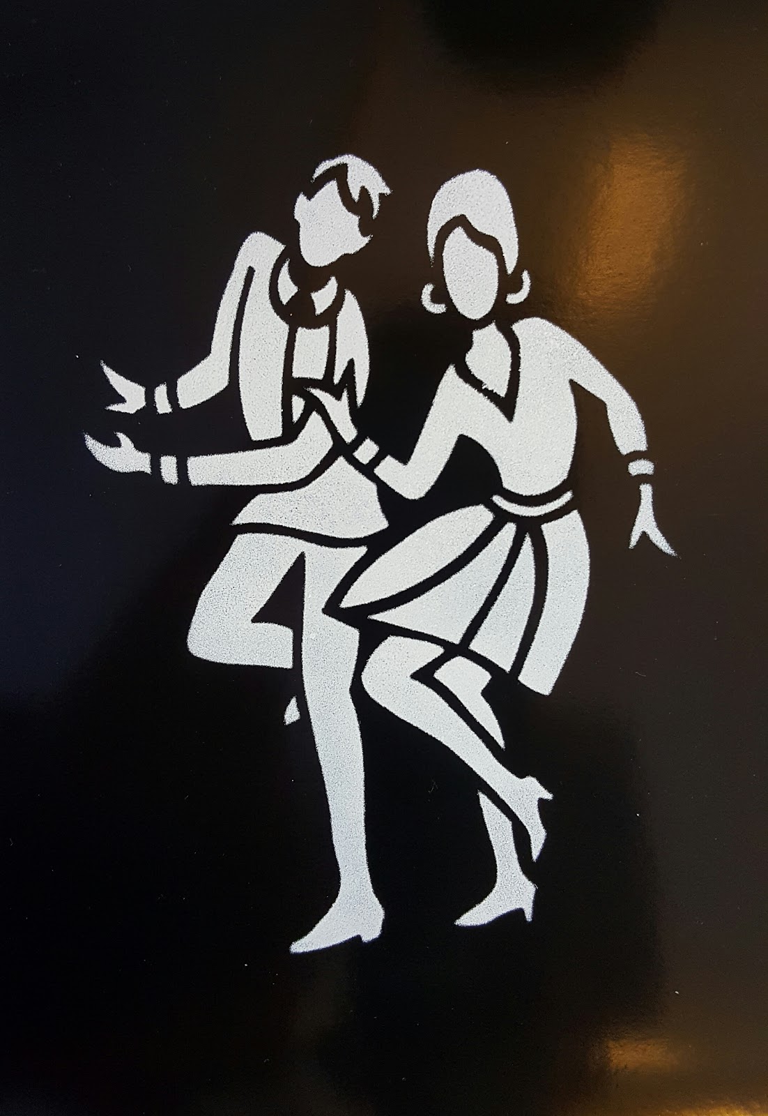
Jayne's Holly & Ivy stamp set- Jayne's Holly & Ivy Unmounted Clear Stamp Set STA-FL-10385-A5
Colouring pencils
Brown sharpie pen
8" card blank - CARD BLANKS & ENVELOPES X 10 8" x 8"DOVE WHITE INK ME!CBIM13
 
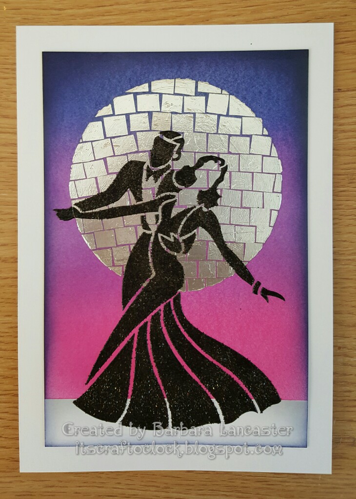
  • Attach the stencil just to the top of the card with masking tape.  This will allow you to lift the stencil without moving its position so you can check on your progress.
  • Brush through randomly with the inks;  building up and blending the colours until you're happy with the result.  Don't be tempted to go too dark.
  • With the stencil still in place, stamp through with "the Holly and the Ivy" in the same colours in a few areas to add a little extra texture and interest.  (Its wise to check on a piece of scrap first, as you may need to use second generation ink). 
  • With a make-up sponge, smear any ink left on the stencil onto the card.  This will make the edges of the design nice and crisp.  Remove the stencil.
  • With potting soil archival, stamp the long embellishments and the words into place. 
  • Add colour to the leaves and stems with pencils, and a drop shadow to the bottom of each square (if desired).  Trim and edge with a sharpie pen, then mount onto a card blank.
 
I hope you like, and maybe feel inspired to have a go at something similar yourself.  I'd love to see it if you do.
 
I'm off for now.  A few things to catch up with before Barbara launches the One Day Special on Hochanda at 6pm.  More wonderful Jayne Nestorenko designs.  Its been a real pleasure to be remembering her by bringing her artwork to life.  Till next time.  Xxx


Monday 5 June 2017

Sew happy to be part of the Clarity Design team!

Hello there!  I can't believe how long it is since I last blogged.  How time flies!  I really must get back into the habit, as I do enjoy our little chats and sharing some of my projects to hopefully inspire you.

As I remembered to take photos while I was making it, I thought I'd share this card I made using the tag and haberdashery stamps.  Masking isn't difficult, but it does require a bit of logical thinking.  I'll often have a practice run on a piece of copy paper to make sure I'm happy with the layout and to make sure I'm clear on the order I need to stamp everything in.

Stamp the largest tag into place, the mannequin and the sentiment in sepia archival, then cover with a mask.  Its always worth while taking time to position the mask accurately, a task that's not always as easy as it sounds.


Stamp one of the smaller tags in place to the side, overlapping slightly.


And again at the other side.  Put the outie mask into position.


Stamp the pincushion and thimble into place;  remove the outie mask, and cover up with the innie mask.


Repeat the process on the other side, this time using the scissors and the tape measure.  Its always worth covering up your card with an extra couple of post-its to prevent any unhappy accidents (and, how does she know this, I wonder?)


Remove the outie mask and cover with the innie.


Repeat again with the last 2 tags;  using the outie mask to allow you to stamp through onto the tag, and then the innie mask which allows you to overlap the stamps if desired, and create the illusion of one being behind the other.


Here we are with all the tags covered with their innie masks.


Using second generation ink, randomly stamp the fabric scrap from the journaling set in pink to ground the tags.


To disguise a little paw print, I added a couple of stitching lines (also from the same journaling set).


Lightly brush pink ink across the bottom of the card.


Remove the masks and go round the edge with a brown sharpie pen.  Add a little bit of shading with coloured pencils.  For a final touch, I decided to decoupage the largest tag, splattering ink and adding ribbon.  I gathered a tiny piece of tulle for a skirt and glued onto the mannequin, leaving some of the threads loose.  Finally this was glued into place, then the card was mounted onto a card blank. 
 

Hope you like it and you feel inspired to try out something similar yourself.  I'd love to see what you do. 

I'm hoping Mr Postman arrives with the stamps for Maria's next shows tomorrow.  I think you're going to love them;  the designs look fabulous, I can't wait to get started.  Till next time.  Xxx


Friday 14 April 2017

A canvas using some very wee stamps

Hello there.  Its been a while...


I thought you might like to see how I made the canvas that was on the last Claritystamp One Day Special shows on Hochanda.


Its not so long ago I would have been terrified of starting out on a big project like this, but with this sort of art you can just go for it without worrying too much.  When you break it down step by step, its not scary at all;  so if you want to, you should definitely try out a project of your own. 
 

It's easier working on a canvas board, but for this project I needed a stretched canvas.  You'll see why later.


I stamped the leaf onto tissue with grey archival ink and mod podged onto the canvas.  This helps with the layout and positioning of stencils and colours later on.


Next stop was to pull grunge paste through the stencil.  We're not looking for perfect here;  just texture.


I tried some random stamping with brown archival using the text from the journalling set.


After a coat of white gesso, I started to flood on some colour with diluted Paperartsy Fresco Finish paints.  The advantage of using these over watercolours is that once dry, the colours are permanent, so they don't go muddy.


I mod podged on some old book page scraps, and using a different stencil, added more grunge paste.


 A slightly darker colour starts to add depth.


To apply the paint, first thin it down with a bit of water.  Spray the area on the canvas where you're going to apply the paint, so that when you add the paint it can spread and move more freely.  And if you want to thin it out and make it spread even more, then just spray again.


Allow each layer to dry before adding the next.  


Some little splatters are good too.  I made sure to keep the background paler where the leaves are going to be placed.


Keep going until you're happy.  I lost count of how many layers I used here.  Most of the time is spent waiting for the layers to dry, so this is an ideal project to have on the go while you're working on other masterpieces!


Now I laid out the twigs that will provide the main structure of the design and planned out each of the little landscapes in the leaves on some copy paper.


Then I painted on some areas of crackle glaze;  varying the thickness.  The crackle effect will develop as the glaze dries;  a thinner coat gives a more delicate effect, the cracks will be larger where the glaze is thicker.


Next job was to make my leaves.  To avoid any potential issues stamping directly on the canvas, I stamped these onto deli paper using black archival.  The sky and landscapes were also done with archival inks to make sure the colours wouldn't bleed when decoupaged onto the canvas (I used DecoArt matte medium);  and how do I know this?  Let's just say it's a good job I did a little trial run.


Once I'd decoupaged the leaves into place, I attached the twigs with some fine wire;  simply by piercing 2 small holes in the canvas and threading the wire through (hence the need for a stretched canvas rather than a canvas board on this occasion). 

In the details below, you can see that I rubbed over the crackle glaze with antiquing cream.


Finally, I coated the canvas with a couple of coats of matt varnish before adding a few highlights with gilding flakes.

I hope you like the finished piece, and that maybe you feel inspired to try out something similar for yourself.

I'll try not to leave it so long for my next post.  Till next time.  Xxx
 

Sunday 19 February 2017

Sketchy lady colour wheel

Hello there.  Just realised I never got round to blogging this sample from January's Claritystamp show.  It was so nice to revisit some old stamps and create something new. 

I decided to use sketchy lady's outfit to create a colour wheel.  So first, I had a quick play on copy paper to make sure the idea would work, and to choose the colours.  I used distress inks:  candied apple, spiced marmalade, mustard seed, lucky clover, mermaid lagoon and wilted violet. 


Then I had a further practice run perfecting the positioning.  So now we're ready to go for it.  Be aware that this is a substantial piece of artwork, so you'll need to start with a piece of card approx 12" square.

I started first by making a deluxe, exclusive piece of equipment as taught by my dear friend Maria Simms at her Shrewsbury workshops. 

Punch a circle from some copy paper, and fold and mark into the required number of equal sections:  I went for 12 here.  Use a piece of blu-tac to hold it in place in the middle of the card.


I started by stamping 12, 3, 6 and 9 o'clock into place.  You can see how I lined up her toe with the marks.


Now its just a matter of working around the circle, lining up sketchy lady's toe with the marks each time.


Lift off your deluxe, exclusive piece of equipment, and there you have a perfect circle at the centre of your wheel.


I worked my way round from 12 o'clock, masking off the outie of each sketchy lady in turn, while I coloured her outfit.  I really love the rainbow effect and some of the colour blends I achieved.  To finish, I used my polychromos to add a little colour to the face and feet, and edged with a black sharpie pen.


I hope you like it as much as I enjoyed making it.  I'll be back soon.  Till next time.  Xxx

Monday 13 February 2017

Ballroom dancing

Hello there.  Blogging again, I hear you say?  I'm definitely on a roll at the moment!  Aren't these new dancer stencils fab?  This one in particular really evokes all the glamour of the ballroom, something I tried to capture in my samples.

For this first one I used picked raspberry, wilted violet and blueprint sketch distress inks and built up the background colour gradually with my Clarity stencil brushes.  It does take quite a bit of time to build up this intensity of colour.  I went round the edge with black distress ink and a blending tool.  I think I might have added a bit of chipped sapphire as well to add even more drama.

Then I started work on the large "glitterball" moon.  I cut out a large circle of double sided adhesive sheet and stuck it into place.  Then, working across a row at a time, stuck the squares of kitchen foil into place.  Buff up when finished, and brush on a little talc to de-tack any exposed adhesive.

All that was left to do was to put the dancers in place.  I always feel a bit nervous when I've done so much work on a project and am about to tackle the final make or break stage.  This time, I got a beautiful crisp image with the black embossing paste and sprinkled on some black distress glitter for a really luxurious effect.


The piece below was done using one of the new Claritystamp designer papers.  I used the softer, more muted side of this particular design as my background.  

I made a paper mask of the stencil design to allow me to overlap the dancing couples.  It took me quite a while to decide on the colour to use for each of the couples as I wanted each one to be different, but still co-ordinate with each other; and tone in with the background too.  I sponged purple ink through the couple at the front;  this would add a barely noticeable shadow once I paper pieced the design, and also provide the much needed guide for accurate placement of each of the pieces.  However, I didn't do the paper piecing until the rest of the design was complete.  Cover the first couple with the paper mask, reposition the stencil and sponge through blue ink.  Repeat this step with pink ink for the third couple.

Add some definition round the edge with a blending tool and purple ink.

Using the other side of the same designer paper, I paper pieced the first couple.  Simply mounted onto white card to finish. 


I hope you like them.  Thanks for visiting.  See you again soon.  Till next time.  Xxx

Saturday 11 February 2017

Colourful dancers

Hello there.  Woke up this morning to a light dusting of snow, but its raining now and the skies are grey.  So what better than a colourful piece of art to brighten the day?

So here goes with another of my DT samples using the lovely new Claritystamp dancer stencils.  If I had to choose, then I think this one is  my favourite.

Difficult to see in the photo, but I started by embossing the stencil onto a sheet of watercolour paper.


Using this faint outline as a guide, I painted the dancers with masking fluid.


Once the masking fluid was dry, I started to layer up washes made with diluted acylic paint.  I used this rather than distress inks because I wanted the colours to remain true rather than blending together.


I left each layer to dry naturally before adding the next.  I even added some rock salt to some layers while the paint was still wet for extra texture.


I love how you can get blends where the colours overlap even though the actual paints haven't mixed together.  I then sponged some archival inks through the words stencil in the same colours.


A few little stars and splattered on some extra paint too.  Rubbed off the masking fluid to reveal the dancers still white beneath.


Just added some definition with a couple of grey pencils and simply mounted onto a white card.


Hope you like it.  Till next time.  Xxx

Monday 6 February 2017

Bursting with colour

Hello there!  We are already in February, and I really want to try and blog more often this year.  It's not always easy to find the time, but I do love coming on here to show you my latest projects and chat about what I love doing most:  making art.

Here is the first of my samples from Barbara Gray's Claritystamp show on Hochanda yesterday afternoon.  I absolutely love these stencils, and had so much fun using them.  

Today I'm going to share a technique I love to do using Colour Bursts.  This is the first time I've tried it out on black card though, and I'm happy to report it worked.

I used the coated black Clarity card and sponged Paperartsy Fresco Finish acrylic in snowflake through the stencil.  You can see below that it's better to go gently and build up the coverage in layers.


This gives a nice crisp design;  just what we want.


Make sure the paint's dry;  it only takes a couple of minutes, then replace the stencil and pull through clear embossing paste.  While it's still wet, sprinkle on the Colour Bursts;  the moisture in the paste will activate them.  I also added a little sprinkling of glitter, then left to dry.

And here you can see the finished design;  very simple and easy to achieve. 
I'll be back soon with another of my samples.  Till next time.  Xxx