Showing posts with label Claritystamp. Show all posts

Sunday, 19 February 2017

Sketchy lady colour wheel

Hello there.  Just realised I never got round to blogging this sample from January's Claritystamp show.  It was so nice to revisit some old stamps and create something new. 

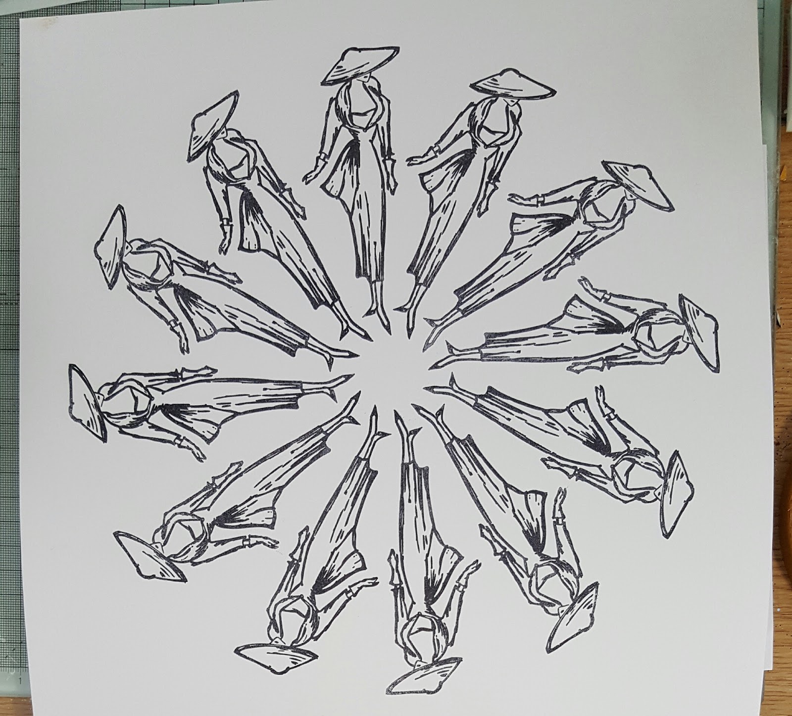
I decided to use sketchy lady's outfit to create a colour wheel.  So first, I had a quick play on copy paper to make sure the idea would work, and to choose the colours.  I used distress inks:  candied apple, spiced marmalade, mustard seed, lucky clover, mermaid lagoon and wilted violet. 


Then I had a further practice run perfecting the positioning.  So now we're ready to go for it.  Be aware that this is a substantial piece of artwork, so you'll need to start with a piece of card approx 12" square.

I started first by making a deluxe, exclusive piece of equipment as taught by my dear friend Maria Simms at her Shrewsbury workshops. 

Punch a circle from some copy paper, and fold and mark into the required number of equal sections:  I went for 12 here.  Use a piece of blu-tac to hold it in place in the middle of the card.


I started by stamping 12, 3, 6 and 9 o'clock into place.  You can see how I lined up her toe with the marks.


Now its just a matter of working around the circle, lining up sketchy lady's toe with the marks each time.


Lift off your deluxe, exclusive piece of equipment, and there you have a perfect circle at the centre of your wheel.


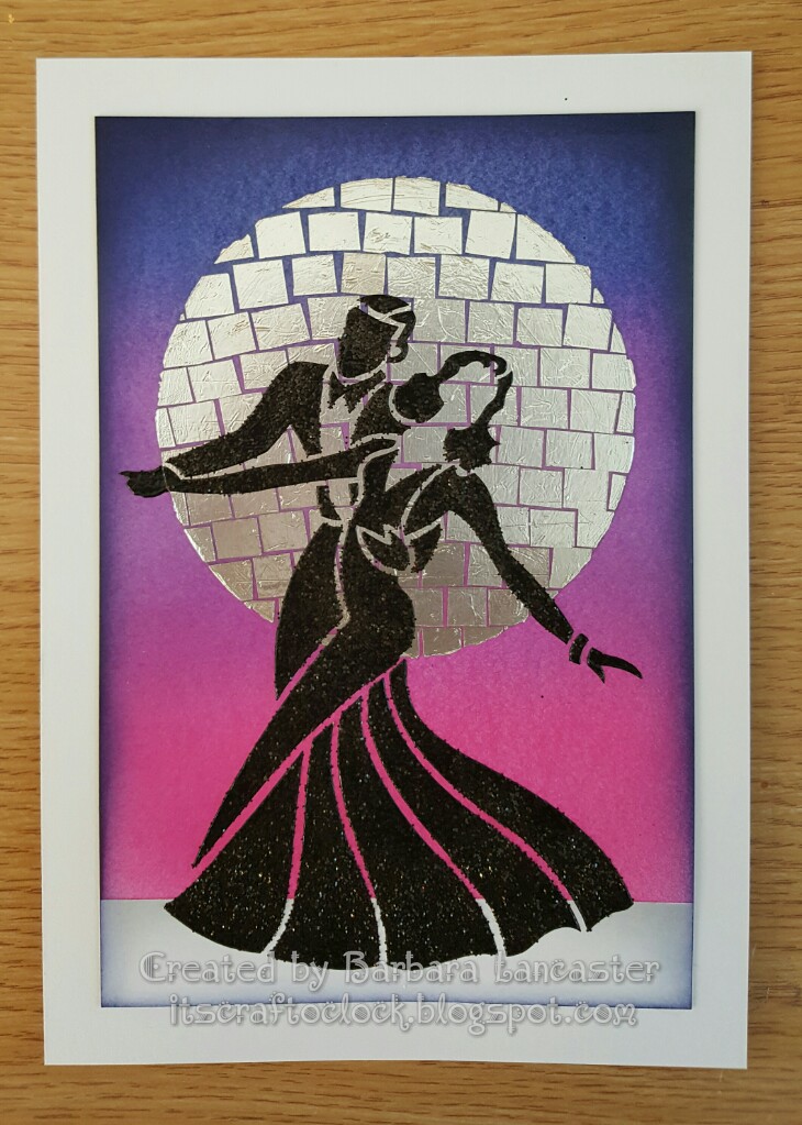
I worked my way round from 12 o'clock, masking off the outie of each sketchy lady in turn, while I coloured her outfit.  I really love the rainbow effect and some of the colour blends I achieved.  To finish, I used my polychromos to add a little colour to the face and feet, and edged with a black sharpie pen.


I hope you like it as much as I enjoyed making it.  I'll be back soon.  Till next time.  Xxx

Monday, 13 February 2017

Ballroom dancing

Hello there.  Blogging again, I hear you say?  I'm definitely on a roll at the moment!  Aren't these new dancer stencils fab?  This one in particular really evokes all the glamour of the ballroom, something I tried to capture in my samples.

For this first one I used picked raspberry, wilted violet and blueprint sketch distress inks and built up the background colour gradually with my Clarity stencil brushes.  It does take quite a bit of time to build up this intensity of colour.  I went round the edge with black distress ink and a blending tool.  I think I might have added a bit of chipped sapphire as well to add even more drama.

Then I started work on the large "glitterball" moon.  I cut out a large circle of double sided adhesive sheet and stuck it into place.  Then, working across a row at a time, stuck the squares of kitchen foil into place.  Buff up when finished, and brush on a little talc to de-tack any exposed adhesive.

All that was left to do was to put the dancers in place.  I always feel a bit nervous when I've done so much work on a project and am about to tackle the final make or break stage.  This time, I got a beautiful crisp image with the black embossing paste and sprinkled on some black distress glitter for a really luxurious effect.


The piece below was done using one of the new Claritystamp designer papers.  I used the softer, more muted side of this particular design as my background.  

I made a paper mask of the stencil design to allow me to overlap the dancing couples.  It took me quite a while to decide on the colour to use for each of the couples as I wanted each one to be different, but still co-ordinate with each other; and tone in with the background too.  I sponged purple ink through the couple at the front;  this would add a barely noticeable shadow once I paper pieced the design, and also provide the much needed guide for accurate placement of each of the pieces.  However, I didn't do the paper piecing until the rest of the design was complete.  Cover the first couple with the paper mask, reposition the stencil and sponge through blue ink.  Repeat this step with pink ink for the third couple.

Add some definition round the edge with a blending tool and purple ink.

Using the other side of the same designer paper, I paper pieced the first couple.  Simply mounted onto white card to finish. 


I hope you like them.  Thanks for visiting.  See you again soon.  Till next time.  Xxx

Saturday, 11 February 2017

Colourful dancers

Hello there.  Woke up this morning to a light dusting of snow, but its raining now and the skies are grey.  So what better than a colourful piece of art to brighten the day?

So here goes with another of my DT samples using the lovely new Claritystamp dancer stencils.  If I had to choose, then I think this one is  my favourite.

Difficult to see in the photo, but I started by embossing the stencil onto a sheet of watercolour paper.


Using this faint outline as a guide, I painted the dancers with masking fluid.


Once the masking fluid was dry, I started to layer up washes made with diluted acylic paint.  I used this rather than distress inks because I wanted the colours to remain true rather than blending together.


I left each layer to dry naturally before adding the next.  I even added some rock salt to some layers while the paint was still wet for extra texture.


I love how you can get blends where the colours overlap even though the actual paints haven't mixed together.  I then sponged some archival inks through the words stencil in the same colours.


A few little stars and splattered on some extra paint too.  Rubbed off the masking fluid to reveal the dancers still white beneath.


Just added some definition with a couple of grey pencils and simply mounted onto a white card.


Hope you like it.  Till next time.  Xxx

Saturday, 14 January 2017

Love shopping?

Hello there.  Hope you've managed to stay warm and dry during these last few days.  Here I am with the first of my samples from the last Claritystamp shows on Hochanda. 

 Using a 7" square of Sheena stamping card I started by masking off a panel.  I always find it best to cover the rest of the card with some copy paper.  I know from experience that if I don't, it's all too easy to end up with ink splodged somewhere it shouldn't be.  Then I stamped my first 2 handbags into position using black archival.


Cover these with post-it masks.


Then stamp and cover up again.


Repeat until you've filled the panel.  

And now you have choices:  leave the post-it masks in place while you work on the background, or...


Use masking fluid as I did, because I found the post-its kept moving. 


I used a mini blending tool to apply mustard seed, picked raspberry and mermaid lagoon distress inks.  I then removed the masking fluid and doodled a border on both sides of the panel.


All that was left to do was add my sentiment using the word chain alphabet and run round the edge with a black sharpie pen and mount onto a card blank.  Hope you like it.  I'll be back soon with another of my samples.  Till next time.  Xxx

Thursday, 1 December 2016

Carol Singing and Christmas Joy!

Hello there!  I can hardly believe that its December already.  Hope you're a bit more organised than me.  I've got a lot to do before I'll be ready for Santa!


This months theme over on the Claritystamp challenge blog is "Carol Singing and Christmas Joy" so you have plenty of scope to make a last minute Christmas card or gift.


I kept it very simple, so no step by step this month.


All stamping done in paradise teal archival.  The partridge was stamped first, then masked with a post-it note before stamping the tree into place.  I used a quickie glue pen  to add some glitter to the leaves and coloured the partridge with my polychromos.


I then stamped the words into place using the word chain alphabet and some of the word chains.  Glitter round the edges and mounted onto a co-ordinating card blank, and voila!!!


Looking forward to seeing all your entries this month.  Its always exciting to see what you come up with.  Don't forget the winner gets a £50 Clarity voucher;  now think how nice that would be...  just in time for the half price members sale!


Hopefully I'll be back soon for a closer look at the samples I've made for this weekend's Claritystamp shows on Hochanda.  The new stamps are just fabulous.  Till next time.  Xxx

Tuesday, 29 November 2016

Butterflies

Hello there!  I thought I'd pop in with a quick blog of my butterfly card from 20th November's Best of Clarity shows on Hochanda. 

First, I blended distress paints on an A5 piece of stencil card.  I think the colours I used were:  candied apple, carved pumpkin, fossilised amber, lucky clover, mermaid lagoon and wilted violet.  The good thing about using paint is that you get full coverage and vibrant colour really quickly and easily.


It took several trial runs on copy paper to work out the positioning of the butterflies before stamping them onto stencil card.


I then cut round the wings with  a really sharp craft knife so that they could be folded up.


All that I needed to do then was to stick this in place on top of the coloured background.


Trim back and edge with a black sharpie pen before mounting onto a card blank. 


Its a clean and simple design, but its very effective I think.  I hope you like it too. 

I can't believe that Barbara Gray is back on the TV on Sunday.  My samples for that show are all boxed up ready for posting tomorrow and I'll be back on Thursday with my Claritystamp Challenge card for December!  Going to be a busy few days!!!  Till next time.  Xxx 

Tuesday, 1 November 2016

A blast from the past - keeping it clean and simple


Hello there!  Its been a while...


I can't believe its 1st November already.  Where does the time go?


This month, we're doing something a bit different over on the Claritystamp challenge blog.  So go on, pick your favourite theme from one of our previous challenges and create a new project.


I decided to go with "Clean and simple" from November last year.


Put the hexagon stencil in place on a 7" x 7" piece of stencil card.


 Brush wild honey distress ink through the aperture, concentrating around the edges and defining them with a make-up sponge, and keeping the centre a bit lighter.


 If you hinge the stencil at the top of the card with low tack tape, you can check your progress.


 Replace the hexagom 'outie' and use the honeycomb 'innie' from one of the square aperture stencils to add some detail, brushing through more wild honey distress ink.


I  used the word chain alphabet and the bee from the agapanthus set designed by Jayne Nestorenko to stamp my sentiment in black archival.


I added a drop shadow with a grey distress marker.


Coloured the bee with my Faber Castell polychromos and added a teeny bit of Glamour Dust glitter to the wings.


All that was left to do was to run a black sharpie round the edge and mount onto a card blank.  I hope you like it.


Its going to be so exciting this month.  I can't wait to see your projects and your favourite themes. 


Don't forget, you could win a £50 Clarity voucher;  but you've got to be in it to win it.  So, go on, why don't you give it a go.  Till next time.  Xxx

Saturday, 1 October 2016

Going round and round in circles!

Hello there!  Just popping in to share my project for this month's Clarity challenge.  The theme this month is to use circles or squares in your artwork.  Why don't you pay a visit to the Claritystamp Challenge blog where you'll find inspiration throughout the month from my talented teamies. 

Don't forget that there's a £50 Clarity voucher up for grabs.  The winner is chosen at random, so everyone has the same chance to win.  Go on...  give it a go!

Time has run away with me this month, so there's no step by step this time.  Its quite an easy one though.


Tape the stencil into position onto a piece of 7" stencil car and mask off the central square with a post-it..

Brush worn lipstick, picked raspberry and wilted violet distress inks through the stencil.  The colours blend together beautifully.  A final bit of blending with a make-up sponge will help to ensure the stencil design is crisp and defined.  

Remove the stencil and mask the outer edges of the central square. 

Stamp the fuchsia into place with black archival, and another twice onto a small piece of stencil card.

Using a compass, mark the circles for the decoupage and cut out.  This is the only part of the fuchsia design that was coloured in;  the rest was left in black and white.

All that was left to do was trim the artwork back slightly and edge with a ruler and a black sharpie pen; before sticking the decoupage circles into place with pinflair glue gel. 

I really like the combination of Jayne Nestorenko's beautiful floral designs with the funky stencil frame;  I hope you do too. 

Off to Port Sunny today.  Hope to see some of you there.  Then, Barbara Gray will be back on the TV on Sunday and Monday.  There are some real treats in store for you.  Hold onto your credit cards!!!  Till next time.  Xxx

Tuesday, 20 September 2016

Jayne Nestorenko's Agapanthus

Hello there!  Have you treated yourself to any of these wonderful floral designs by Jayne Nestorenko yet?  Groovi plates or stamps;  you know you need them!  For now, I wanted to share a little piece of art I created using the beautiful new agapanthus stamp set.   

I'm going to concentrate on the frame first.  I wanted to get a proper gilded frame effect, so I did a little test piece first, to make sure my idea would work out.  And yay!  it did!  So here goes..

I stamped the frame and swirls into place onto stencil card using black archival.


Then I cut out the frame.

Next, I started to apply glossy accents to the areas of the design that I wanted to appear raised.  This stage required a bit of patience as I had to work in stages and leave plenty of time for it to dry.


Its very difficult to photograph, but I hope you can see in the details below.  I didn't stress too much if it wasn't quite perfect, as all I'm trying to do is create raised areas.


Once dry,  I washed over with DecoArt paynes grey acrylic. 


To add a greater sense of dimension to the frame, I went around the inner edge of the frame with another coat.  What I really love about this paint is that its transparency allows the stamped detail to show through. 


The glossy accents resists the paint.


Let it dry thoroughly;  then very, very gently so you don't overcook it, apply silver gilding wax.  The raised areas will pick this up and the whole piece will take on a metallic sheen.  Keep going until you achieve the lustre you want.


You can buff it lightly with a soft tissue too which will really bring out the sheen.


Now to concentrate on making the actual picture.

I made the background using antique linen and old paper distress inks;  first splodging onto my blending mat and spritzing with water, then "free" stamping (without a mount), in the same colours to add texture.


As well as this piece on stencil card, I also did the same on some paper that I could use for my decoupaged agapanthus. 

The flower was stamped in black archival and coloured with my gorgeous new Faber Castell polychromos;  the most fabulous present for my 50th birthday from my husband Martin.  I've just reorganised my craft room, so they can take pride of place.  I love looking at them, stroking them and using them! 


Preparing the layers for the decoupage involved a lot of very intricate fussy cutting, which I quite enjoy doing, although it was very fiddly.


The final touch was to add a little angelina fibre and film butterfly.


I mounted the finished piece onto some foam board.  I hope you like it.


Jayne's beautiful designs are a pleasure to work with, and I have a sneaky feeling that at least one more of the sets may fall into my shopping basket at Leyburn on Saturday. 

I am so looking forward to catching up with Barbara and all the Clarity team, and loads of Clarity friends.  Its sure to be a great day.  Till next time.  Xxx