Showing posts with label Stencils. Show all posts

Monday, 13 February 2017

Ballroom dancing

Hello there.  Blogging again, I hear you say?  I'm definitely on a roll at the moment!  Aren't these new dancer stencils fab?  This one in particular really evokes all the glamour of the ballroom, something I tried to capture in my samples.

For this first one I used picked raspberry, wilted violet and blueprint sketch distress inks and built up the background colour gradually with my Clarity stencil brushes.  It does take quite a bit of time to build up this intensity of colour.  I went round the edge with black distress ink and a blending tool.  I think I might have added a bit of chipped sapphire as well to add even more drama.

Then I started work on the large "glitterball" moon.  I cut out a large circle of double sided adhesive sheet and stuck it into place.  Then, working across a row at a time, stuck the squares of kitchen foil into place.  Buff up when finished, and brush on a little talc to de-tack any exposed adhesive.

All that was left to do was to put the dancers in place.  I always feel a bit nervous when I've done so much work on a project and am about to tackle the final make or break stage.  This time, I got a beautiful crisp image with the black embossing paste and sprinkled on some black distress glitter for a really luxurious effect.


The piece below was done using one of the new Claritystamp designer papers.  I used the softer, more muted side of this particular design as my background.  

I made a paper mask of the stencil design to allow me to overlap the dancing couples.  It took me quite a while to decide on the colour to use for each of the couples as I wanted each one to be different, but still co-ordinate with each other; and tone in with the background too.  I sponged purple ink through the couple at the front;  this would add a barely noticeable shadow once I paper pieced the design, and also provide the much needed guide for accurate placement of each of the pieces.  However, I didn't do the paper piecing until the rest of the design was complete.  Cover the first couple with the paper mask, reposition the stencil and sponge through blue ink.  Repeat this step with pink ink for the third couple.

Add some definition round the edge with a blending tool and purple ink.

Using the other side of the same designer paper, I paper pieced the first couple.  Simply mounted onto white card to finish. 


I hope you like them.  Thanks for visiting.  See you again soon.  Till next time.  Xxx

Saturday, 11 February 2017

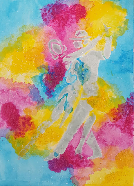
Colourful dancers

Hello there.  Woke up this morning to a light dusting of snow, but its raining now and the skies are grey.  So what better than a colourful piece of art to brighten the day?

So here goes with another of my DT samples using the lovely new Claritystamp dancer stencils.  If I had to choose, then I think this one is  my favourite.

Difficult to see in the photo, but I started by embossing the stencil onto a sheet of watercolour paper.


Using this faint outline as a guide, I painted the dancers with masking fluid.


Once the masking fluid was dry, I started to layer up washes made with diluted acylic paint.  I used this rather than distress inks because I wanted the colours to remain true rather than blending together.


I left each layer to dry naturally before adding the next.  I even added some rock salt to some layers while the paint was still wet for extra texture.


I love how you can get blends where the colours overlap even though the actual paints haven't mixed together.  I then sponged some archival inks through the words stencil in the same colours.


A few little stars and splattered on some extra paint too.  Rubbed off the masking fluid to reveal the dancers still white beneath.


Just added some definition with a couple of grey pencils and simply mounted onto a white card.


Hope you like it.  Till next time.  Xxx

Tuesday, 1 November 2016

A blast from the past - keeping it clean and simple


Hello there!  Its been a while...


I can't believe its 1st November already.  Where does the time go?


This month, we're doing something a bit different over on the Claritystamp challenge blog.  So go on, pick your favourite theme from one of our previous challenges and create a new project.


I decided to go with "Clean and simple" from November last year.


Put the hexagon stencil in place on a 7" x 7" piece of stencil card.


 Brush wild honey distress ink through the aperture, concentrating around the edges and defining them with a make-up sponge, and keeping the centre a bit lighter.


 If you hinge the stencil at the top of the card with low tack tape, you can check your progress.


 Replace the hexagom 'outie' and use the honeycomb 'innie' from one of the square aperture stencils to add some detail, brushing through more wild honey distress ink.


I  used the word chain alphabet and the bee from the agapanthus set designed by Jayne Nestorenko to stamp my sentiment in black archival.


I added a drop shadow with a grey distress marker.


Coloured the bee with my Faber Castell polychromos and added a teeny bit of Glamour Dust glitter to the wings.


All that was left to do was to run a black sharpie round the edge and mount onto a card blank.  I hope you like it.


Its going to be so exciting this month.  I can't wait to see your projects and your favourite themes. 


Don't forget, you could win a £50 Clarity voucher;  but you've got to be in it to win it.  So, go on, why don't you give it a go.  Till next time.  Xxx

Saturday, 1 October 2016

Going round and round in circles!

Hello there!  Just popping in to share my project for this month's Clarity challenge.  The theme this month is to use circles or squares in your artwork.  Why don't you pay a visit to the Claritystamp Challenge blog where you'll find inspiration throughout the month from my talented teamies. 

Don't forget that there's a £50 Clarity voucher up for grabs.  The winner is chosen at random, so everyone has the same chance to win.  Go on...  give it a go!

Time has run away with me this month, so there's no step by step this time.  Its quite an easy one though.


Tape the stencil into position onto a piece of 7" stencil car and mask off the central square with a post-it..

Brush worn lipstick, picked raspberry and wilted violet distress inks through the stencil.  The colours blend together beautifully.  A final bit of blending with a make-up sponge will help to ensure the stencil design is crisp and defined.  

Remove the stencil and mask the outer edges of the central square. 

Stamp the fuchsia into place with black archival, and another twice onto a small piece of stencil card.

Using a compass, mark the circles for the decoupage and cut out.  This is the only part of the fuchsia design that was coloured in;  the rest was left in black and white.

All that was left to do was trim the artwork back slightly and edge with a ruler and a black sharpie pen; before sticking the decoupage circles into place with pinflair glue gel. 

I really like the combination of Jayne Nestorenko's beautiful floral designs with the funky stencil frame;  I hope you do too. 

Off to Port Sunny today.  Hope to see some of you there.  Then, Barbara Gray will be back on the TV on Sunday and Monday.  There are some real treats in store for you.  Hold onto your credit cards!!!  Till next time.  Xxx

Thursday, 1 September 2016

In the garden...

Hello there!  I can't believe August is over already.  Time passes by so quickly...  And not just this year either;  I celebrated my birthday on 13th August, and find myself asking wondering how on earth I've reached 50!!!

Anyway, enough pondering;  its 1st September and that means its time for a new theme over on the Claritystamp Challenge blog.  This month, we're asking you to produce artwork on the theme of  "in the garden."

I took my inspiration from the beautiful verse:  Kind hearts are the gardens, kind thoughts are the roots, kind words are the flowers, kind deeds are the fruits.

Using garden patina archival ink I stamped the Shepherd's Purse into place, then stamped the verse in sections.  I did this by covering up the other parts of the stamp with a post-it so I only inked up the section of the stamp I was working with.


Next I coloured in the flowers and leaves using my new Faber Castell polychromos.  I am a very, very lucky girl as my husband Martin bought me the full set in a beautiful wooden case for my birthday:  best present ever! 


Here is a little detail below.


Then I used a versamark pen and kaleidoscopic embossing powder to glaze the flowers and leaves.  I did 2 coats to ensure full coverage and a nice even finish.


I positioned the heart stencil and used low tack masking tape to secure in place.


Using Picked Raspberry and Peacock Feathers distress inks, I brushed these gently through the stencil;  concentrating along the diagonal top right to bottom left.  The embossed areas will resist the ink which can then be gently wiped away.


I replaced the stencil and did a little bit of random stamping using the same colours using the script stamp from the journaling set.


I decided to colour my own card to mat the finished artwork.  Using the same inkpads, I smeared the colour directly around the edges of the card, blending with a make-up sponge where the colours meet.  I sprinkled with water and blotted with kitchen roll;  this lifts a bit of the colour and adds texture.


I added further texture by randomly stamping with both the script stamp and the "Kind hearts" stamp.


All that was left to do now was to mat and layer onto a card blank.


I hope you like the finished card;  quite simple and enjoyable to do.  If you still need more inspiration pop over to the Challenge blog to look at the work done by my talented teamies.  Even if you've never joined in before, why don't you give it a go;  the winner is chosen at random, so whether you're a beginner or have been crafting for years you could still win a £50 Clarity voucher.  Now wouldn't that be nice?

I'm hoping to be back soon with the samples I've done ready for this Sunday's Clarity shows on Hochanda.  Till next time.  Xxx


Monday, 1 August 2016

I do love a bit of fussy cutting...


Hello there!  Really sorry not to have had chance to catch up sooner, but its been a very busy couple of weeks for me at work.  And its the start of August already, and time for a new theme over
on the Claritystamp challenge blog.  This month we're showcasing a technique which you'll be able to do with either stamps or groovi:  fussy cutting.  

So here goes with my project;  inspired in part by last month's NDC stencil projects. I loved this stencil as soon as I saw it.  I started off by stamping the owls into place using black archival and covering with a mask.


I used the gelli plate with chalk Freso Finish acrylic to pull a print of the trees.  This dries almost immediately, so then I spritzed the paper, replaced the stencil and sprinkled on some Colour Bursts.  I used orange, with a tiny bit of yellow and hot pink.  You have to be a bit careful not to add too much water or the colour will spread too much under the edges of the stencil.


I kept the mask in place over the owls and used gold acrylic to pull another gelli print of the trees.  The mega mount is invaluable for perfect positioning every time when you are layering prints like this.  The gold just adds a very subtle shimmer to the trees.

I still felt that the trees needed more definition, so I set to work with my spectrum noir pencils, mainly in shades of grey.  I did this over a few days, just a bit at a time to make sure I didn't overcook it.


Plenty of shading round the owls brings them to the foreground and gives a real 3d effect.  It adds drama too, I think.


I made some background pieces by smearing distress inks in similar colours onto a blending mat and spritzing with water, before picking up with a sheet of paper.  Personally, I like to layer and dry each colour separately, rather than blending them together on the mat, as I find they're less likely to go muddy.

I then used these pieces to stamp out some oak leaves, then cut them out and started to experiment with where to place them.

I also coloured in the owls with spectrum noir pencils in shades of orange and hot pink.  For me the touch of pink intensifies the warmth and vibrancy of the orange. 


At this point I also decided to add in little snippets of orange and hot pink tulle along with the leaves.  They were all stuck into place using Prima 3d gloss gel.


You can see some details below, and then the finished piece which I mounted in a wooden frame.


I made this for my dear friend Maria Simms' birthday.  I won't see her until the 6th, so I really hope she'll like it.  She's been warned not to peek if she wants it to be a surprise!

I hope you like it too, and that I have given you some inspiration for your own project.  What will you do?  I can't wait to see...  Don't forget you could win a £50 voucher to spend on Clarity goodies.  But you have to be in it to win it, so go on give it a go.  Till next time.  Xxx 


Thursday, 14 July 2016

Kitchen foil... not just for cooking!

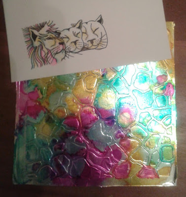
Hello there!  As promised, here I am with one of my favourite makes from Barbara Gray's last Claritystamp shows on Hochanda.  It was inspired by Emma Williams' article in last month's Making Cards magazine. 


I started off by mod podging kitchen foil onto a piece of 7" square stencil card.  Once dry, I ran it through my ebosser with one of the Savannah stencils. 


I started laying down yellow, blue and bright pink alcohol inks with a blending tool and blending felts.


It wasn't as vibrant as I wanted, so I dripped on the colours direct from the bottle.  That'll do!


I stamped the lions with black soot distress ink, then added some colour using the same alcohol inks with a blending pen.  This was a technique I first tried at one of Maria Simms' monthly Clarity workshops in Shrewsbury.


The detail below shows how the "mane" effect was created with oddments of ribbons and threads.
 

I edged the main piece with gilding wax and glitter, the mounted directly on black for impact.
 

I hope you like it.  Hopefully, I'll be back soon.  I would really like to share my mosaic bangle with you too.  Till next time.  Xxx