Monday, 12 October 2015

Just a corner?

Hello again!  Here are 2 more of my cards from last months Clarity show on Hochanda, this time focusing on this gorgeous holly and star corner which comes in 2 sizes.


I made the first in a traditional vintage style, stamping in black archival and colouring with distress markers.  To complete the vintage look, I brushed antique linen distress ink round the edges.  Simply matted and layered to finish.


This second one has a more modern, funky feel.  I made another deluxe, exclusive piece of equipment to help with the placing of the corner and get a neat circle in the middle.  This one took a few practice runs on copy paper to get the positioning right.  All stamping in black archival on watercolour card and the stars masked off with masking fluid, brushos sprinkled on and spritzed with water, and some colour added to the borders with spectrum noir pencils.  A little bit of red stickles added to highlight the holly berries, then simply matted and layered to finish.


Which one's your favourite?  I'd love to know what you think.  Till next time.  Xxx 

Wednesday, 7 October 2015

Charming...


Hello again.  This is another of my cards from last months Clarity show on Hochanda using the beautiful new ballerina stamps.  I think this one has quite an Art Deco look about it.


I marked the centre of my card, and made what my dear friend Maria Simms would call a deluxe, exclusive piece of equipment! (aka a punched out and folded post-it circle to use a guide for positioning).  And yes, I did have a couple of practice runs first on some copy paper to check how it worked out.  


All stamping done in black archival, then the dancers were coloured with spectrum noir pencils and a touch of gold glitter added to their oufits.


Just simply matted and layered, and a tiny gold gem in the centre to finish.


I know how lucky I am to be part of the Clarity design team;  thanks to Barbara Gray for believing in me and my work.  I was very proud to see this card on one of the artwork display boards at Port Sunlight last weekend along with work from my talented teamies.  Its such a great feeling;  it really is a dream come true.  Till next time.  Xxx 

Saturday, 3 October 2015

Chicken wire

Hello there!  Well today has been a great day at Port Sunlight, catching up with loads of crafty pals, admiring loads of beautiful artwork on display, and soaking up loads of ideas and inspiration from talented demonstrators.  Oh, and not forgetting loads of shopping!

I thought I would share one of my favourite samples from last months Clarity show on Hochanda. using a technique I learned at one of Maria Simms workshops in Shrewsbury.  Thank you Maria!

 
It was really easy to do. 
  • I dragged grunge paste through the chicken wire stencil and left to dry.
  • Using the tags stencil, I cut out a tag, glued a cardboard 'nut' into position, and painted both pieces with blue acrylic paint.
  • Once this was dry, I painted both pieces with black acrylic paint, then wiped some off with a baby wipe (if I'm honest, a few baby wipes!!!!)  I deliberately left it quite grungy as I wanted this 'dirty' industrial look.
  • Then I dry brushed with a tiny bit of silver acrylic paint to highlight.
  • The sentiment was stamped in versamark and embossed with silver detail powder. 
  • Some screw head brads, and then matted and layered to finish.
I have to admit I was really pleased with this one, I hope you like it too.  Till next time.  Xxx


Thursday, 1 October 2015

Go stencil crazy!

Hello again.  Yes, its that time again already.  If you didn't enter last months Clarity challenge, I'm hoping maybe me or one of my talented teamies can inspire you to create a project using your Clarity stencils.  I'm looking forward to seeing loads of fabulous entries this month.
 
Here is my project...
 
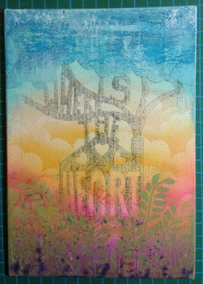
First, I inked up the centre of the "Home is where the heart is" stencil with watering can archival, taped it into place onto an A5 canvas board and ran it through my embossing machine.
 
 
Using the stencil as a guide, I cut a paper mask of the cloud line, and spread grunge paste over the whole top section of the canvas.
 
 
In a similar way, I spread grunge paste over the lower section.  I tried sprinkling colour burst powders onto the grunge paste while it was still wet to represent flowers, but AAAAAAAAGGGHHHHHHHHH!!!!  Don't like that!
 
 
 Then, to make it even worse;  when I tried spritzing with water, I discovered that I'd got some higher up on the canvas.  It looked a right mess, but I decided to carry on.
 
 
 Then I used a mixture of distress inks and Paperartsy fresco finish paints to colour the clouds, and worked down the canvas with inks.  I tried to create the effect of a beautiful sunrise or sunset. 


OMG!!!!!!  That colour burst smudge is getting worse!
 
 
Then I used a mask to add clouds into the background.  
 
 
Now it was time to start thinking about what I could do to disguise that awful smudge:  foliage and flowers will do nicely.  I used Paperartsy paint through the olive wreath stencil, moving it as required. 
 
 
Next, I cut the house out of an old book page, inked the edges before sticking down, then added a few more leaves to ground it.
 
 
I replaced the home is where the heart is stencil, and pulled grunge paste through the words as shown.
 
 
I added ink to the words, and some charcoal to add depth and shadow.
 
 
Now for some flowers in the garden.  More grunge paste, this time through the flower stencil;  and those colour bursts are still coming through!
 
 
I sponged some white paint through the stencil onto some canvas, ready to colour and fussy cut.
 
 
I coloured the flowers with Spectrum Noir pencils.
 
 
As a final quirky touch, I added some keys for flower stems.

 
This was a project I really enjoyed making:  a journey where I took a few wrong turns because I didn't really know exactly where I was headed until I got there!  I hope you like it, and that maybe you feel inspired to try out a stencil project of your own.  Thanks for visiting;  hope to see you again soon.  Till next time.  Xxx