Thursday, 14 July 2016

Kitchen foil... not just for cooking!

Hello there!  As promised, here I am with one of my favourite makes from Barbara Gray's last Claritystamp shows on Hochanda.  It was inspired by Emma Williams' article in last month's Making Cards magazine. 


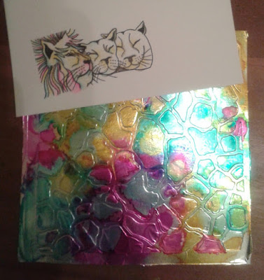
I started off by mod podging kitchen foil onto a piece of 7" square stencil card.  Once dry, I ran it through my ebosser with one of the Savannah stencils. 


I started laying down yellow, blue and bright pink alcohol inks with a blending tool and blending felts.


It wasn't as vibrant as I wanted, so I dripped on the colours direct from the bottle.  That'll do!


I stamped the lions with black soot distress ink, then added some colour using the same alcohol inks with a blending pen.  This was a technique I first tried at one of Maria Simms' monthly Clarity workshops in Shrewsbury.


The detail below shows how the "mane" effect was created with oddments of ribbons and threads.
 

I edged the main piece with gilding wax and glitter, the mounted directly on black for impact.
 

I hope you like it.  Hopefully, I'll be back soon.  I would really like to share my mosaic bangle with you too.  Till next time.  Xxx 

Friday, 1 July 2016

A fairytale day out


Hello there.  Well the best laid plans, good intentions and all that...  so much for blogging!  Its the 1st July already and so its time for a new theme over on the Claritystamp challenge blog.  Why don't you pop on over and look at all the fabulous inspiration from the rest of the design team?  This month's theme is "a day out:"  so where are you going to go to?  The seaside?  The countryside?  The city?  Its up to you!

I decided to take a fairytale trip to the land of far, far away.

I used a little Creative Expressions mdf shrine as the basis of my project.  I started by painting the back panel with white gesso.


I stamped the castle from the Happily Ever After set onto copy paper so I could decide on its position.  Then I put a moon mask into place.


I put the treeline mask into place, to provide a forest background for the castle.

Then I started to brush distress inks into place for the sky:  picked raspberry and wilted violet used here.


More distress ink added;  blueprint sketch this time.


Then I covered up the sky with the other half of the treeline mask. 


I sponged in the trees with green distress ink.  I put the moon mask outie into place and added a little mustard seed distress ink.


I then used the treeline stamp to add in some more trees, this time in green archival.


Then I stamped the castle into place with black archival.


I then stamped the castle again in black archival onto some stencil card and added some subtle colour with spectrum noir pencils.  I added a delicate shimmer by applying a thin coat of DecoArt Interference Magenta which gives a pearlised effect.


This was cut out and mod podged into place.


The rest of the mdf was coated in black gesso.  I set to work now on creating a colourful, floral background for the front of the piece.

I started by spritzing mustard seed, picked raspberry and mermaid lagoon distress inks and schmoosing them around onto stencil card.  I find I get better results by working with each colour separately and drying the card in between;  the colours seem to stay truer, with less risk of muddying into one another.


Then I stamped the flower bouquet randomly in the same colours.  For this sort of thing, I often work freestyle with the stamp in my hand for a less perfect result.


This piece was then cut to cover the front of the shrine.  I drew round one of the tree framer stencils and cut it out.  As the card was textured, I added a little bit of interest with a tiny touch of gilding wax.


You can see here that I had stamped Alice onto a piece of stencil card, coloured her in and cut her out.  Then I started to lay out possible compositions until I found one I was happy with.


I used some Sweet Lilac flowers, coloured to match my project with diluted distress inks and glued them into place.

You can also see how I gathered some organza ribbon to make a grassy bank for Alice to sit on and added a little fairy toadstool.


I made tiny bunting using the letterbox shapes on shrink plastic and a couple of teeny weeny fairies (also shrink plastic) to hold it in place. 


Let's take a closer look and check out some of the details.


An Angelina fibre butterfly was the final finishing touch.


And here's the final finished piece...


I hope you like it.  I am so looking forward to seeing where you each of you will be taking us for a day out. 

Don't forget, the winner of the £50 Clarity voucher is chosen completely at random, so why don't you give it a go and join in.

I'm looking forward to a wonderful crafty weekend;  a Clarity workshop with Maria Simms at Shrewsbury on Saturday and Barbara on the telly on Sunday.  You're going to love the new stamps and stencils.  So this time I promise I will back soon.  I have one of my samples from the show in particular that I want to share with you.  Till next time.  Xxx  

Wednesday, 1 June 2016

Masculine


Hello there!  I can't believe how fast the time is speeding by;  its June already!  And a new month means the start of a new Clarity challenge.  This month we're asking you to make something for one of the men in your life;  now we all know how difficult that can be...  


Rather than revisiting some of my favourite "male" stamps, I decided to go for something different, and use the galleon and ocean swirl set that I bought a while ago, but which were still pristine and unused, (and no doubt, feeling unloved!)


I played about a bit to find the right colours and stencil for a gelli print I could use for my background sea.  In the end, it was Paperartsy Fresco Finish paints in Caribbean Sea and South Pacific, and System 3 Gold acrylic.  In my opinion, you really need a mega mount to produce perfectly layered gelli prints;  it makes it so easy to line up each layer so that you get that lovely hand printed edge.


I then brayered Peacock Feathers distress ink onto the gelli plate for the sky;  now you would be lucky to get this lined this up without a mega mount.


Then I stamped the galleon into place using black archival ink.


Then, using the same paints, I pulled a couple of prints with the Ocean swirl stencil on card and then on parchment.  I tore these out to create the wild, crashing waves.


A bit of whitework on the parchment swirls to add highlights, and to suggest the foaming crests of the waves.


I laid these out along with the stamps to make sure I was happy with the composition.


Then I stamped both the swirls into place with versamark and used one of the fancy Frantage embossing powders.  I particularly love this one with its little flecks of gold. 


I added a drop shadow with a light charcoal pencil;  you can see below what a difference it makes.


Using a versamark pen, I emphasised the crests of the waves with a little embossing powder too.


 For the final flourish, to create a really wild, raging sea I coiled some strips of card to make swirls of various sizes, then glued into place.  Now some of you will know that this is a technique we did at a recent retreat with Maria Simms.  And you will not be able to believe that I actually did more curling!  I can hardly believe it myself!


And that's it.  Simply edged with black and mounted on to a plain white card blank.


I hope you like the finished card.  I did enjoy the whole process of making this one;  playing with different ideas and techniques, and letting it grow and develop as it went. 


Now I can't wait to see what you're going to come up with.  There's some really great work entered into the challenge every month, and it gets harder and harder to choose our top 5.  No need to worry if you're a beginner though;  the winner is chosen at random, so everyone has the same chance to win that £50 Clarity voucher.     


I have set myself a challenge too:  to be back soon for a chat and share another of my cards.  So hopefully it won't be long till next time.  Xxx